Introduction to client-side development
➤What are the main elements of client-side application components of distributed systems?
➤Explain different categories of elements in HTML, proving examples for their use
➤Discuss the importance of CSS, indicating new features of CSS3
Cascading Style Sheets, commonly known as CSS, is an integral part of the modern web development process. It is a highly effective HTML tool that provides easy control over layout and presentation of website pages by separating content from design.


Component-based development techniques involve procedures for developing software systems by choosing ideal off-the-shelf components and then assembling them using a well-defined software architecture. With the systematic reuse of coarse-grained components, CBD intends to deliver better quality and output.
Component-based development is also known as component-based software engineering (CBSE).
Engineering PC or controller
This controller is the supervisory controller over all the distributed processing controllers. Control algorithms and configuration of various devices are executed in this controller. Network communication between processing and engineering PC can be implemented by simplex or redundant configurations.
Distributed controller or Local control unit
It can be placed near to field devices (sensors and actuators) or certain location where these field devices are connected via communication link. It receives the instructions from the engineering station like set point and other parameters and directly controls field devices.
It can sense and control both analog and digital inputs / outputs by analog and digital I/O modules. These modules are extendable according to the number of inputs and outputs. It collects the information from discrete field devices and sends this information to operating and engineering stations.
In above figure AC 700F and AC 800Fcontrollers acts as communication interface between field devices and engineering station. Most of the cases these act as local control for field instruments.
Operating station or HMI
It is used to monitor entire plant parameters graphically and to log the data in plant database systems. Trend display of various process parameters provides the effective display and easy monitoring.
These operating stations are of different types such as some operating stations (PC’s) used to monitor only parameters, some for only trend display, some for data logging and alarming requirements. These can also be configured to have control capabilities.
Communication media and protocol
Communication media consists of transmission cables to transmit the data such as coaxial cables, copper wires, fiber optic cables and sometimes it might be wireless. Communication protocols selected depends on the number of devices to be connected to this network.
For example, RS232 supports only for 2 devices and Profibus for 126 devices or nodes. Some of these protocols include Ethernet, DeviceNet, foundation filed bus, modbus, CAN, etc.
In DCS, two or more communication protocols are used in between two or more areas such as between field control devices and distributed controllers and other one between distributed controllers and supervisory control stations such as operating and engineering stations.
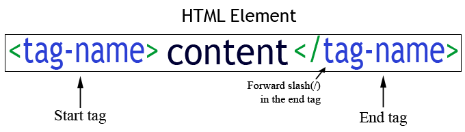
An HTML document is made up of many HTML elements. An HTML elements looks like this
The element consists of a start tag, end tag and the content, which goes between the start tag and the end tag.
HTML Tags
A tag contains a tag-name enclosed in angle brackets (<). HTML has a set of predefined tag names. Each predefined tag-name has its own function. for example the ‘<h1>’ tag is to display headings while the ‘<p>’ tag is to display paragraphs. A HTML element contains a start tag that marks the beginning of the content and a end tag that marks the end of the content.
Lets consider this example <h1>This is the Heading</h1>
Start tag-‘<h1>’ marks the beginning of the the content i.e the heading ‘This is the Heading’ and the
End tag-‘</h1>’ marks that the content/heading has finished.
So the following points are the key to writing HTML Elements.
- The start tag is written with opening and closing angle brackets <tag-name>.
- The end tag for the same elements is written with a slash(/) just before the tag name, </tag-name>
- Content goes inside the start and the end tag.
- All these tags are case insensitive. But the content inside is case sensitive. So the content inside <p>/<P> tag will be displayed as capital if you write the content in capital.
HTML Tag inside another Tag.
In HTML you can also write a tag inside the content of another tag, for instance if we want to display some bold text inside a paragraph, we will use the <b> tag (This tag is used to display bold text) inside the content of <p> tag. As follows
HTML Code:
Output:
This is a paragraph this will be shown as bold text, normal text starts again.
This is a paragraph this will be shown as bold text, normal text starts again.
Void Elements
Not all elements need to have a start and end tag, some elements which are known as Void elements or the empty elements do not have a content , and hence they don’t need an end Tag.
Example of a void element is <br> which is used to break a line (generate a new line). <br> is usually used as a nested element inside another tag, mostly the <p> tag.
Void Elements can be written in two ways.
Simply as a start tag : <tag-name>
Self closing tag : <tag-name/>
Both of them are valid and will produce the same result but the first one is preferred.
HTML Code:
Output:
The br element creates a
new line and so does the
self closing version of it.
new line and so does the
self closing version of it.
White space and new lines have no effect on HTML.
No matter how much white space you have between the content of a tag, it will be counted as 1 white space. The same goes with lines , if you create a new line in your HTML document that would not be shown in the output on a browser, the <br> tag can be used to create a new line in the output.
HTML Code:
Output
Notice the no of spaces here and in the output.
HTML Code:
Output
No matter how many new lines You add in the HTML document the output will have no new line until you use the br tag.
Cascading Style Sheets, commonly known as CSS, is an integral part of the modern web development process. It is a highly effective HTML tool that provides easy control over layout and presentation of website pages by separating content from design.
Although CSS was introduced in 1996, it gained mainstream popularity by the early 2000s when popular browsers started supporting its advanced features. The latest version, CSS3, has been available since 1998 and was last updated in September 2008.
Benefits of CSS in Web Development
Improves Website Presentation
The standout advantage of CSS is the added design flexibility and interactivity it brings to web development. Developers have greater control over the layout allowing them to make precise section-wise changes.
As customization through CSS is much easier than plain HTML, web developers are able to create different looks for each page. Complex websites with uniquely presented pages are feasible thanks to CSS.
Also Read: 6 Important Steps for Planning Your Web Design
Makes Updates Easier and Smoother
CSS works by creating rules. These rules are simultaneously applied to multiple elements within the site. Eliminating the repetitive coding style of HTML makes development work faster and less monotonous. Errors are also reduced considerably.
Since the content is completely separated from the design, changes across the website can be implemented all at once. This reduces delivery times and costs of future edits.
Helps Web Pages Load Faster
Improved website loading is an underrated yet important benefit of CSS. Browsers download the CSS rules once and cache them for loading all the pages of a website. It makes browsing the website faster and enhances the overall user experience.
This feature comes in handy in making websites work smoothly at lower internet speeds. Accessibility on low end devices also improves with better loading speeds.
Limitations of CSS Technology
Browser Dependent
The only major limitation of CSS is that its performance depends largely on browser support. Besides compatibility, all browsers (and their many versions) function differently. So your CSS needs to account for all these variations.
However, in case your CSS styling isn’t fully supported by a browser, people will still be able to experience the HTML functionalities. Therefore, you should always have a well structured HTML along with good CSS.
Difficult to retrofit in old websites
The instinctive reaction after learning the many advantages of CSS is to integrate it into your existing website. Sadly, this isn’t a simple process. CSS style sheets, especially the latest versions, have to be integrated into the HTML code at the ground level and must also be compatible with HTML versions. Retrofitting CSS into older websites is a slow tedious process.
There is also the risk of breaking the old HTML code altogether and thus making the site dead. It’s best to wait till you redesign your website from scratch.
As you can see from above points, the advantages of CSS development outweigh its limitations. It is a very useful web development tool that every programmer must master along with basic HTML.
1. Editing content within the elementsYou can edit content within an element by using an HTML attribute called contenteditable. There is a CSS property -webkit-user-modify similar to contenteditable which determines whether or not a user can edit the content. The default value is always read-only and read-write value of -webkit-user-modify allows the user to edit the content. Here’s an example:
1
2
3
4
| <h2 contenteditable=true>You can edit me</h2>h2{-webkit-user-modify:read-write;} |
2. Form attribute required
This particular feature ensures that the form is not submitted if an input box with required attribute is empty. The required attribute can also be used as a selector to style the element. Here’s an example:
This particular feature ensures that the form is not submitted if an input box with required attribute is empty. The required attribute can also be used as a selector to style the element. Here’s an example:
1
2
3
4
| <input type="text" name="required Field" required="required">input:required{background:red;} |
3. Regular expressions
Verifying textbox is simple. For verifying any particular textbox, we can insert regular expression directly into an element. We can check a textbox value against the regular expression specified in the pattern attribute. Here’s an example
Verifying textbox is simple. For verifying any particular textbox, we can insert regular expression directly into an element. We can check a textbox value against the regular expression specified in the pattern attribute. Here’s an example
1
| <input type="text" name="rollno" pattern="[0-9]{5}"> |
In the above example, input box should contain only five characters (the characters can only be numerals)
4. Figure tagFigure tag includes figcaption tag through which we can associate captions with an image element. Apart from images, we can also include audio, video, chart, SVG, and canvas in the figure tag. Here’s an example
1
2
3
4
5
6
| <figure> <img src="http://static1.tothenew.com/blog/wp-content/uploads/2017/03/productimg.png"> <figcaption> <p>Image of birds</p> </figcaption> </figure> |
5. SVG element
The SVG element can be used to draw various shapes on a web page since these are vector based. They can also be scaled, up or down to any extent without losing the image quality. Here’s an example
The SVG element can be used to draw various shapes on a web page since these are vector based. They can also be scaled, up or down to any extent without losing the image quality. Here’s an example
1
2
| <svg xmlns="http://www.w3.org/2000/svg" viewBox="0 0 64.47 53.44"> <path id="Shape_5_copy" data-name="Shape 5 copy" class="rewind-svg gray-icon" d="M2758.62,4719.2l28.92-23.09a1.538,1.538,0,0,1,.98-0.34,1.633,1.633,0,0,1,.71.16,1.672,1.672,0,0,1,.9,1.49v19.26l25.75-20.57a1.585,1.585,0,0,1,.99-0.34,1.56,1.56,0,0,1,.7.16,1.672,1.672,0,0,1,.9,1.49v46.16a1.672,1.672,0,0,1-.9,1.49,1.56,1.56,0,0,1-.7.16,1.585,1.585,0,0,1-.99-0.34l-25.75-20.57v19.26a1.672,1.672,0,0,1-.9,1.49,1.633,1.633,0,0,1-.71.16,1.538,1.538,0,0,1-.98-0.34l-28.92-23.09A1.673,1.673,0,0,1,2758.62,4719.2Z" transform="translate(-2756 -4693.78)"></path> </svg> |
6. Webfonts
With the help of @fontface rule, we can include any source file for fonts. At a later point, we can refer it through font-family declaration. Here’s an example
With the help of @fontface rule, we can include any source file for fonts. At a later point, we can refer it through font-family declaration. Here’s an example
@font-face {
font-family: ‘opensanssemi';
src: url(“../fonts/OpenSans-Semibold.ttf”) format(“truetype”);
}
Element font-family will be:
p{
font-family:opensanssemi;
}
font-family: ‘opensanssemi';
src: url(“../fonts/OpenSans-Semibold.ttf”) format(“truetype”);
}
Element font-family will be:
p{
font-family:opensanssemi;
}
7. Gradient
Gradient displays a combination of two or more colors. They can either be linear or radial. For the responsive layouts, it is better to use gradient image over the background image. Here’s an example:
Gradient displays a combination of two or more colors. They can either be linear or radial. For the responsive layouts, it is better to use gradient image over the background image. Here’s an example:
background: -webkit-linear-gradient(to bottom,rgba(36,4,3,.8) 41%,rgba(0,0,0,0) 100%);
background: linear-gradient(to bottom,rgba(36,4,3,.8) 41%,rgba(0,0,0,0) 100%);
background: linear-gradient(to bottom,rgba(36,4,3,.8) 41%,rgba(0,0,0,0) 100%);
Below is the example of a linear gradient changing color from dark to light brown
8. Animation and Transition
We can use both Transition and Animation when it is required to change an element from one state to another. The difference is that animation can be made up of multiple states, providing control over its animation. Here’s an example
We can use both Transition and Animation when it is required to change an element from one state to another. The difference is that animation can be made up of multiple states, providing control over its animation. Here’s an example
@-webkit-keyframes expand-bottom-overlay {
0% {
top: -6.5em; }
100% {
top: 0;
} }
0% {
top: -6.5em; }
100% {
top: 0;
} }
This will animate element from -6.5em to 0
➤Compare and contrast the 3 main types of CSS selectors
1 – Type Selector
Type Selectors are very simple. They correspond with any HTML element type. For example, add the following code to your blank CSS file; these are three simple Type Selectors:
1 | body { |
2 | font-family: Arial, sans-serif; |
3 | font-size: small; |
4 | } |
5 |
6 | h1 { |
7 | color: green; |
8 | } |
9 |
10 | em { |
11 | color: red; |
12 | } |
This code selects and styles our <body> element, as well as all <h1> and <em> elements on our page.
2 – ID Selectors
If you take a look at the code of our HTML page, you’ll notice we have a <div> element with an ID of intro. We assign elements IDs when they are unique on a page; there is only one “intro” section on our page. This is important, because two elements cannot have the same ID.
When an element has an “ID” we can access it with a CSS selector by placing a pound sign (#) in front of it’s ID value. Add the following code to your CSS file, directly below our <h1> rule:
1 | #intro { |
2 | font-size: 130%; |
3 | border: 1px solid black; |
4 | } |
3 – Class Selectors
Class Selectors are very similar to ID Selectors. The major difference is that while a certain ID should only be assigned to one element, we can assign the same class to as many elements as we want.
If you look at the code of our HTML page, you’ll notice that two of our paragraph tags have a class of “important.” When an element has a class we can access it with a CSS selector by placing a period in front of it’s class name. Let’s add the following rule to our CSS file to make these paragraphs stand out:
1 | .important { |
2 | background-color: yellow; |
3 | } |
4 – Descendant Selectors
Imagine we wanted the important paragraph in the “intro” Div to look different than the important paragraph at the bottom of the page. We can use a Descendant Selector to achieve this.
Add the following CSS rule at the bottom of our CSS file:
1 | #intro .important { |
2 | background-color: orange; |
3 | } |
Let’s dissect how the selector is working. It begins with “#intro” which selects our Intro Div. This is followed by a space, and then “.important.” So essentially our selector is telling the web browser to (1) find the element with the ID of intro, (2) go inside that element and find any elements with the class of important.
Notice that within the orange paragraph, the word “important” is red. Let’s imagine we want to change the color, since red text on an orange background is difficult to read. The word “important” is inside an <em> element, so we’ll use the following code to select and style it;
1 | #intro .important em { |
2 | color: white; |
3 | } |
This code is telling the browser to (1) find the element with an ID of intro, (2) go inside that element and find any elements with a class of important, (3) go inside that element and select any <em> elements.
➤Discuss the advanced CSS selectors, explaining the specificity
Partial Selectors
Ends With ($=)
Selecting an element with CSS that has a repetitive suffix would look like this:
div[id$=“_myDiv”] {
// cool CSS stuffs
}
The first thing to note is the
div with the brackets surrounding the id$ attribute. The div tag can be any element in the DOM from input to span and so on. This is awesome if you’re trying to target a specific element that has a dynamic prefix like this:<!-- HTML -->
<div id="0125_LoginPanel">
Some sample content
</div>
So to target this
div just use the selector like before and write:div[id$="_LoginPanel"] {
margin: 0 3em;
padding: 1em;
}
Since we are targeting the specific suffix you would use the
$ following the id attribute within the brackets. Then within quotes add the suffix of the element you are trying to target.div[id$=“myDynamicDiv”] {
// cool CSS stuffs
}
You can do it for any element (div, span, img, etc…), and any common attribute (id, name, value, etc…).
Begins with (^=)
Much like the “ends with” section above you can target elements with specific prefixes. The only difference than before is what character you add to the selector following the
= sign.<!-- HTML -->
<div class="myPanel_1435">
<h1>My custom panel</h1>
</div>
Then the selector would look like this:
div[class^="myPanel_"] {
// cool CSS stuffs
}
Simple enough right? All we did that’s different than the
ends with ($=) selector is target the prefix by adding a ^ symbol in front of the = sign. You may also notice this time I used a classinstead of an id. CSS is flexible enough to pretty much let you target anything as I stated earlier.Contains (*=)
What if your have both a dynamic prefix and suffix? Well, luckily you can target an element that simply contains a parameter.
<div class="1gdug_logoutPanel_4828fde">
<h1>My Custom Logout Panel</h1>
<form>...</form>
</div>
Targeting this could look like:
div[class*="logoutPanel"] {
// cool CSS stuffs
}
So essentially any
div that contains the text logoutPanel can be selected like the example above.
➤Explain the use for CSS media queries in responsive web development
A media query is a tool in CSS that allows for us to implement responsive design elements. When I say responsive, what I mean is what I’m going to show you right here. I have two nearly identical sites. One is responses and uses media queries, and the other one is not. We’re going to walk through, after this demo, we’re going to walk through the code and we’re going to implement a full media query for this homepage. Let’s first look at a media query based site. If I open this up, what I can do is it looks good on desktop and then if I were to access this on a mobile device, which I can mimic by just bringing this down here, you can see that the entire site readjusts. This is what someone coming on an Android or an iPhone would see. You notice how we have the logo has readjusted. It’s now at the top. And then we have the navigation elements are stacked on top of each other. And then the same thing with the contact information.
Then everything else has also readjusted. This is looking really good. This is the kind of experience you’d want to see on a mobile device. Now, if you open up a site that does not have the media query though, and then try to perform the same action, you’re going to get very different behavior. Notice now, if I take this down to the same size, that it does not readjust. Someone accessing the site’s going to load it up and they’re going to see this distorted looking page. They’re going to have to scroll to the right. A bunch of things are kind of shrunk in and overlapping. This is really not a good experience. This is the reason why media queries are so powerful. Now that we have a good idea on what they are, let’s walk through how we can implement them.
I have this page open and I have the code open for it right here. I’m going to start by creating a new style sheet here called media queries. This isn’t necessary, this is just because I want to be able to have all my media queries in one spot. It will also be easy for us to see them. Let me open that up and in the styles directory, I’m going to save a file called media queties.css. Then here, we’re going to be able to add all of those. Now, the syntax for using a media query is … it looks a little bit different if you’ve never used it before. It starts with a @ symbol. Then you say media. Then this is a method or a function. That means it takes an argument. The very first thing that we have to provide is the breakpoint. If I say medium max-width. Then I’m going to use 615 pixels. What this is going to do is this is going to say that whenever we have a screen that is below 615 pixels wide, which is a pretty standard size for using with smartphone devices, then I want you to apply these styles.
Now, whenever you’re using media queries, a trick to make sure that you are following is your media queries should be at the very end. They should be the last styles that you include. The reason for that is because if you have media queries and then you call other styles after that, they will override it. You need to make sure you call that at the very end. What this is going to do is the browser’s going to look, it’s going see all of these media queries, and it’s going to check and say, “Okay, these are the styles I am going to apply, and I’m going to run these if the screen is 615 pixels or less.” You could do this for any of them. Let’s just test this out.
If you look at the index here in the navigation wrapper, you can see that we have navigation wrapper and then we have all of these items inside of it. We have a left column, a center column div, and then a right column. I think this is going to be a great place to start. If I say navigation-wrapper. Then inside of here, I’m going to change the flex direction. Instead of having the default row, I’m going to change it to column. Then I also want to update the height so it’s 100%. Let’s see what this does for us on our site that previously was not working on mobile. Let me open this up in a new browser window. Now, if I shrink this down, you can see that when we hit that breakpoint, you see how this got readjusted. Before, that was not working. Before, it just simply went to the side and then it didn’t shrink down and it didn’t stack it on top of each other like that.
➤Identify the pros and cons of 3 ways of using CSS
Pros of Using a CSS Framework
1. Speeds up your development
A CSS framework lays out the groundwork for you so you can start developing quicker. It does that by giving you code for repetitive and common tasks—like resets—so you don’t need to write from scratch every time. And if you’re working with a team or collaborating with other developers, you all will have the same shared CSS code, so collaborative efforts are sped up as well.
2. Enables cross-browser functionality
Remember the hair-pulling frustration of having to constantly tweak your CSS code so that your website or web app looks similar on all browsers? Well, you can say goodbye to that annoyance by using a CSS framework, which takes care of that for you. It’s already coded to look similar across all browser, so you can focus on customizing and creating content rather than tweaking the base appearance. A CSS framework will also eliminate browser-specific bugs, which is a nice plus.
3. Gives you clean and symmetrical layouts
A grid-based CSS framework sets up a multi-column arrangement with predefined pixel widths so you can focus on creating content rather than lining up blocks of text. No more tweaking the pixel widths of columns to make sure they line up, or wondering if your sidebar width is standards-compliant for widgets or images, or any other annoyances that comes from guessing or figuring out what width you need to make your columns.
4. Enforces good web design habits
A CSS framework enforces good habits like including a print stylesheet. It also gives you a set of selectors that you’ll use for all websites and web apps that you develop with the framework, which creates consistency in your web design. You don’t have to guess or remember what you did for one site or another – it’s all consistent.
Cons of Using a CSS Framework
1. Restricts your freedom
Since a CSS framework has a standard set of grids, selectors, and other code, it limits what you can design: layout sizes, grid width, button types, styles, and anything else. You’re basically stuck with the same framework if you really want to save time and take advantage of using a CSS framework. Otherwise, you’ll spend time changing code or learning a new framework each time you want to do something different – like if you have a project which requires unique or unconventional parameters or design.
2. Adds extra code
A CSS framework will inevitably have code that you don’t need. Its highly unlikely that you’ll use every feature of a framework. You’re thus stuck with extra code, which could or could not be an issue depending on how light and lean you want to make your website or web app. If every byte is crucial, you’ll need to go in and strip away unused code in your CSS.
3. Forces you to use the framework’s semantics
By using a CSS framework, you’re forced into semantic changes, especially if the framework uses a non-standard naming scheme. This could be an annoyance if you have a preferred unique system for CSS elements and selectors and ID and class use and such, since the CSS framework will force you to use its system. Admittedly, it’s not a big deal for most—it’s like learning to drive a new car ie. you quickly adapt—but it is a reality of using a CSS framework. An issue where it can be a bigger problem is if you’re collaborating with other developers or designers or creating for a client that will later access code; they’ll have no idea what some of the names are, so they’ll need to become familiar with the framework’s semantics first.
4. You could potentially lose time
If you’re already familiar and effective with a certain way of designing and developing and you’re forced to use a CSS framework you’re not familiar with, you could potentially lose time. This could be a case of a client wanting to use a framework you’re not familiar with, or collaborating with designers who insist on a particular framework, or whatever else. Point is, CSS frameworks are a reality, they exist out there, people are aware of them, and some will want to use frameworks that you don’t care for and could accomplish the same task faster using your own way. Yeah, this is a bit of a stretch for a con, but like with the previous con, it’s a reality of CSS frameworks so it goes in the ‘cons’ list just in case.
CSS Framework Pros and Cons
Ultimately, are CSS frameworks good? Of course, for the same reason automatic transmission is good in cars. Meaning, most will use automatic transmission because it helps them drive how they need to simpler and faster. And when you get a new car, you get used to it pretty quickly. But there is a smaller subset of drivers who want to or need to drive using manual transmission – either for fuel efficiency, enjoyment, racing, or whatever other reason.
Most will benefit from the web development and design simplification that CSS frameworks give. But there will be a smaller subset who will stick to doing those tasks themselves to get precise control and results – just like manual drivers with gear shifting.
➤Identify frameworks/libraries/plugins/tools to develop the Views/web pages, and discuss
their similarities and differences
Library
Library is described as “a collection of implementations of behavior, written in terms of a language, that has a well-defined interface by which the behavior is invoked.”
The principle
What does it mean? To understand libraries we need to go back to beginnings of libraries. One of the biggest issues back then was how complicated the code was. Since applications had to be written as a whole, when they got bigger and more advanced, the number of bugs drastically increased. In 1959 JOVIAL introduced a way to split an application into smaller parts. The new solution became a basis for what we now know as libraries.
The next big step was the implementation of so-called “Linux way” or a “KISS Rule” (KISS= Keep It Simple, Stupid). To fulfill the latter any module or library had to do one thing and do it well. Combining this with the “Divide and conquer” principle (in which every difficult problem can be split into multiple smaller problems, which are then independently solved) we get the current library system.
Framework
Framework is described as “an abstraction, in which software providing generic functionality can be selectively changed by additional user-written code, thus providing application-specific software”.
The principle
Let's analyze what that means. The first thing we should do is think about what “abstraction” means. Well, in programming it describes something that is half finished, when it's up to an end-user (or end-class) to fill the gaps to complete it. Another thing to note about “abstraction” is that it already contains information about what those gaps are and how they should be filled. Let's take an iterator as an example. Iterator is an abstraction that must have a way of getting current object and moving to next one. Similarly, a framework contains a list of rules that need to be fulfilled to make the finished product.
Second thing we should note about a framework is that it often combines libraries and “packages”. We already know what is a library, what about those “packages”? Each framework has its own name for those. In Laravel they are called “packages”, in Symfony “bundles”, in other frameworks they may have different names. The easiest way to understand packages is imagining them as reversed libraries, where API is provided not by the library, but by a framework. This has a few consequences:
- every package should instantly work in a specific framework,
- package made for one framework cannot be used in other frameworks,
- packages are often bound to specific versions of framework, since package API must exactly match framework API
If you look at this list, you may think that libraries are far superior to packages. Because of that it's a common practice to create packages as proxies to libraries and keep the functional code in the library itself. This way you will have advantages of both worlds.
Advantages
One of the biggest benefits of frameworks is an easiness of creating code. Let's use the previous example of the database to check out Laravel:
Plugins
A plugin is a piece of software containing a group of functions that can be added to a WordPress website. They can extend functionality or add new features to your WordPress websites. WordPress plugins are written in the PHP programming language and integrate seamlessly with WordPress. In the WordPress community, there is a saying that goes around: “there’s a plugin for that”. They makes it easy for users to add features to their website without knowing a single line of code. There are thousands available for free to download at the official WordPress plugin directory. At WPBeginner, we write about all the best WordPress plugins. We have even shared a list of all the plugins we use. Aside from free plugins, there are tons of amazing commercial ones available from third-party companies and developers.
➤Discuss the Controller development technologies for the browser-based client-components
of web-based applications
Component-based development (CBD) is a procedure that accentuates the design and development of computer-based systems with the help of reusable software components. With CBD, the focus shifts from software programming to software system composing.
Component-based development techniques involve procedures for developing software systems by choosing ideal off-the-shelf components and then assembling them using a well-defined software architecture. With the systematic reuse of coarse-grained components, CBD intends to deliver better quality and output.
Component-based development is also known as component-based software engineering (CBSE).
Techopedia explains Component-Based Development (CBD)
Object-oriented modeling results in a plethora of fine-grained classes, objects and relationships. It is very hard to discover reusable parts among these smaller units. The idea behind CBD is to integrate the related parts and reuse them collectively. These integrated parts are known as components.
Component-based development techniques consist of non-conventional development routines, including component evaluation, component retrieval, etc. It is important that the CBD is carried out within a middleware infrastructure that supports the process, for example, Enterprise Java Beans.
The key goals of CBD are as follows:
- Save time and money when building large and complex systems: Developing complex software systems with the help of off-the-shelf components helps reduce software development time substantially. Function points or similar techniques can be used to verify the affordability of the existing method.
- Enhance the software quality: The component quality is the key factor behind the enhancement of software quality.
- Detect defects within the systems: The CBD strategy supports fault detection by testing the components; however, finding the source of defects is challenging in CBD.
- Minimized delivery:
- Search in component catalogs
- Recycling of pre-fabricated components
- Improved efficiency:
- Developers concentrate on application development
- Improved quality:
- Component developers can permit additional time to ensure quality
- Minimized expenditures
- Component development
- Component publishing
- Component lookup as well as retrieval
- Component analysis
- Component assembly
➤Discuss the new features in JS version 6
1. Angular Elements
Angular is a perfect framework for developing Single Page Applications. To create a widget or component that can be included in any existing web page, was not a simple task in earlier versions of Angular. But in Angular 6, it can be done with the help of Angular Elements. Actually, Angular 6 is the first Angular release which completely supports Angular Elements. Angular Elements is the brainchild of Angular’s Rob Wormald. The Angular Elements package will give us the ability to create an Angular component and then publish that component as a web component which can be used in any HTML page (even if that page is not using the Angular framework) in other environments. It actually takes an Angular component and then wraps it within a custom element, such as a DOM element, so that we can use our favorite Angular component in other projects which do not use Angular.
2. Service Worker Support
Service workers are basically scripts which run in the web browser and manage to cache an application. Service workers were first introduced in Angular 5. In Angular 6, service workers come with some bug fixes, including some new functionalities. So when we deploy the latest version of the application, we may need to deactivate or uninstall the existing service worker(s). In Angular 5, there is no straightforward option for doing this, but Angular 6 brings this functionality with the new script file named safety-worker.js, which is actually a part of the production bundle which helps us to unregister the existing service worker(s).
Angular 6 now supports the configuration of navigation URLs within the Service Workers. The service worker will redirect navigation requests that don’t match any source or data group to the specified index file. Now, we can mention an optional navigationUrls list in ngsw-config.json files which contain the desired URLs. If, for example, a request's URLs match any of the positive patterns and none of the navigate patterns, then it will be considered a navigation request and handled the right way by the service worker. In Angular 6, the service worker remains in the current mode unless the server is reconnected and updates the work.
3. Bye, Bye Template Element
The <template> element was depreciated one year ago when Angular 4 was launched. Now it’s time to say goodbye to <template> because it is now removed from Angular 6 framework. Instead of using <template>, we now need to use <ng-tempalate>.
4. i18n
One of the major changes in Angular 6 is internationalization or i18n. In Angular 6, i18n is coming with runtime rendering so that there is no requirement to build one application per locale. The currency pipe was improved in Angular 6 in such a that it makes a lot of sense, for example, it will not round every currency value with 2 digits anymore. It will then round the currency to the appropriate digits (like it can be 3 digit roundup for Arabic Dinar or 0 roundup for Chilean Pesos). If we want to retrieve these values programmatically, then we need to use the i18n function
getNumberOfCurrencyDigits(). There are some other formatting functions which are also exposed publicly like formatDate, formatCurrency, formatPercent, and formatNumber.5. Ivy: New Rendering Engine
In Angular 6, the Angular team introduced their third rendering engine called Ivy. Ivy is the next generation Angular rendering engine. In some of the previous versions of Angular (i.e. Angular 2 to Angular 4), Angular used a view engine for rendering purposes. The introduction of this rendering engine experience increases the speed and decreases the size of the application. The Angular team expects the same type of experience with the new rendering engine.
Angular compiles our templates into equivalent TypeScript code and then that TypeScript code is compiled to JavaScript and then the result is shipped to our users. So Ivy renderer is the new rendering engine which is basically designed to support backward compatibility with existing renderers and then also focused to improve the speed of rendering and it also optimized the size of the final package. In Angular, it will not be the default renderer but we can manually enable it using the compiler options. This important feature is not completely released in Angular 6 since it is in experimental mode; except the complete version in Angular's next release.
6. ngModelChange
Before Angular 6, the
ngModelChange event was emitted before the said form control updating. If we have an event handler for the ngModelChange event that checked the value through the control, the old value will be returned instead of the changed value. Now, in Angular 6, ngModelChange has emitted the value after the value is updated in the form control.7. ElementRef<T>
In previous versions of Angular, when we want to create the reference of an element in the template, we can use
@ViewChild or @ViewChildren or inject the host using ElementRef directly. But, the problem is that ElementRef had its nativeElement property typed like any other element. But now in Angular 6, we can use type ElementRef more strictly if we want.8. Bazel Compiler
Bazel Compiler is actually a build system or mechanism which is used to build nearly all software at Google. This compiler only rebuilds what is necessary to build. Since source code changes very often, it does not make any sense to rebuild the entire application for every little change. Instead of rebuilding the entire application, we build only the code which actually changes and also that code that depends on those changes. So with the help of advanced local and distributed caching, optimized dependency analysis and parallel execution, we can achieve fast and incremental builds. With Angular 6, we will have this compiler support.
9. RxJS 6.0
Angular 6 now used RxJS 6 internally. So we need to update our application accordingly. These changes provide developers an increase in performance and are easier to debug AJAX call stacks and improve modularity also, making it as backward compatible as possible. But RxJS changed the way we import things.
In RxJS 5, you were probably writing:
RxJS 5.5 introduced the pipeable operators:
And RxJS 6.0 changed the imports to:
So, as per the above code demonstration, we need to change the import of RxJS across our application for Angular 6. But I will say that we don’t need to change this right now. Because RxJS released a library called rxjs-compat, which allows us to use RxJS version 6.0 with the old version syntaxes.
10. Tree Shaking
Angular 6 moved from modules referencing services to services referencing modules to make the Angular app smaller. Tree shaking is a build optimization step which tries to ensure any unused code does not get used in our final bundle. Instead of rendering template data and passing that directly into the interpreter which knows how to do everything, the new renderer is going to generate the template instructions directly. This results in much smaller bundles and a faster startup time.
There is a new way to define an injectable service in Angular 6. With this new way, we can register a provider directly inside the
@Injectable() decorator, using the new providedIn attribute. It accepts ‘root’ as a value or any module name from our application. When we use ‘root,’ it means this injectable will be registered as a singleton object in the application and we don’t need to add it to the providers of the root modules. In the same way, if we use provideIdIn:LoginModule, then injectable is registered as a provider of the LoginModules without adding it to the providers of the modules.
So, in the above section, we discuss most important features of the Angular 6. Apart for these, there are also several features, like:
- The router sometimes hits a race condition while a route is being instantiated and a new navigation request arrives. This issue has been solved in Angular 6.
- Avoid overriding
ngInjectableDefin the decorator is present on the type. - Angular Material Library uses Component Dev Kit (CDK) which provided 30+ UI components. CDK also allows us to build our own library of UI components using Angular Material.
- Angular CLI generates Angular artifacts using the technology called Schematics. If you decide to create your own template, then the Angular team has added the
ng-addcommand in Angular-CLI which let's users download and install new packages in an Angular app. - If the user wants to upgrade their Angular app from Angular 5 to Angular 6, Angular team added support for
ng-updateto its Angular-CLI which let the user update and upgrade packages. - The 2.6 version of Typescript’s “
resolveModuleName” started to require passed-in paths to be separated by '/' instead of being able to handle '\'. - Improved decorator error messages.
- Enable size tracking of a minimal CLI render3 application.
- The Angular team has decided to extend the long-term support (LTE) to all major releases starting with v4.
- Web pack module bundlers have been updated to version 4 and have Angular CLI support.
REFERNCES


Comments
Post a Comment